Immerse yourself in the stunning visual journey through a modern house situated in the Netherlands, where every photograph showcases the harmony of design and functionality. This photo series captures the essence of modern architecture, from an exterior photo that showcases sleek lines and sophisticated color palettes to interior design shots that reveal thoughtful spaces that embody comfort and style.
Every frame provides a reference photo for enthusiasts and architects alike, revealing aspects of design that make this house distinctly modern. The walls adorned with carefully curated photo frames tell stories of the house and its inhabitants, creating a personalized touch to the modern design.
One standout feature of this house is the photo wall. A dynamic blend of art and architecture, it not only enhances the aesthetic appeal of the house but also serves as an ever-evolving canvas for the homeowners’ creativity.
This modern house isn’t just about beautifully posed images; it’s about the stories that unfold within its walls, the lives it shelters, and the memories it helps create. Even a ‘fake’ photo or staged image in the house seems to blend seamlessly with its modern aesthetics, offering intriguing visual elements that capture attention.
The best modern house design photo encapsulates the essence of the house — the interplay of light and space, the blend of materials, and the harmony of form and function. Each image in this series captures these elements, offering viewers a chance to appreciate the nuance and beauty of modern architecture.
In this collection, each photo of the modern house contributes to a larger narrative about contemporary living, design preferences, and the endless possibilities of modern architecture. Stay tuned as we guide you through this photographic exploration of modern house interior design in the Netherlands.
Photo of a modern house interior design in the Netherlands
Photo of modern house interior design
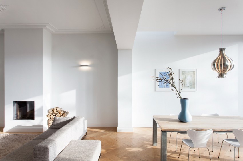
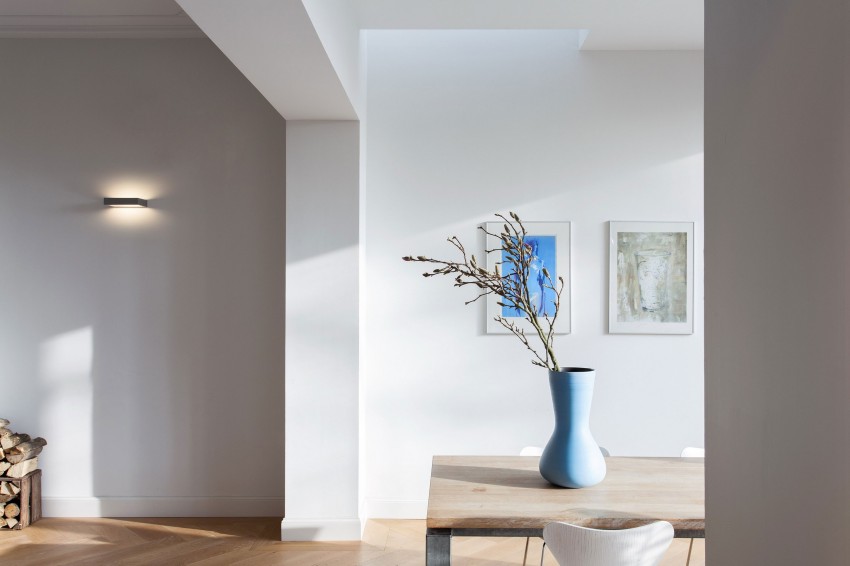
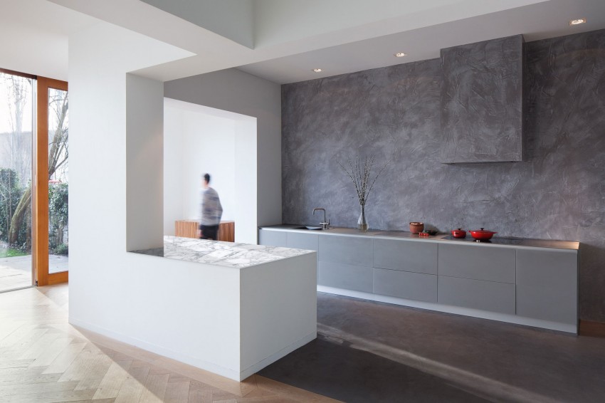
We present to our readers a photo of a modern interior design of a house designed by Zecc Architecten in 2012 in the Netherlands.
This house has gone through many metamorphoses. It was used as an office building for a while but is now returning to its original function.
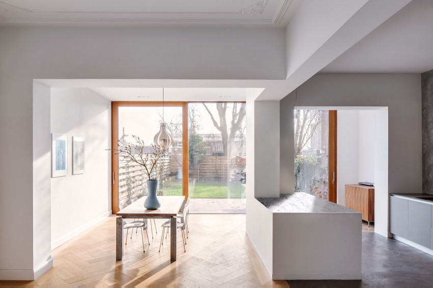
Former office space
Panoramic and roof windows fill the house with natural light.
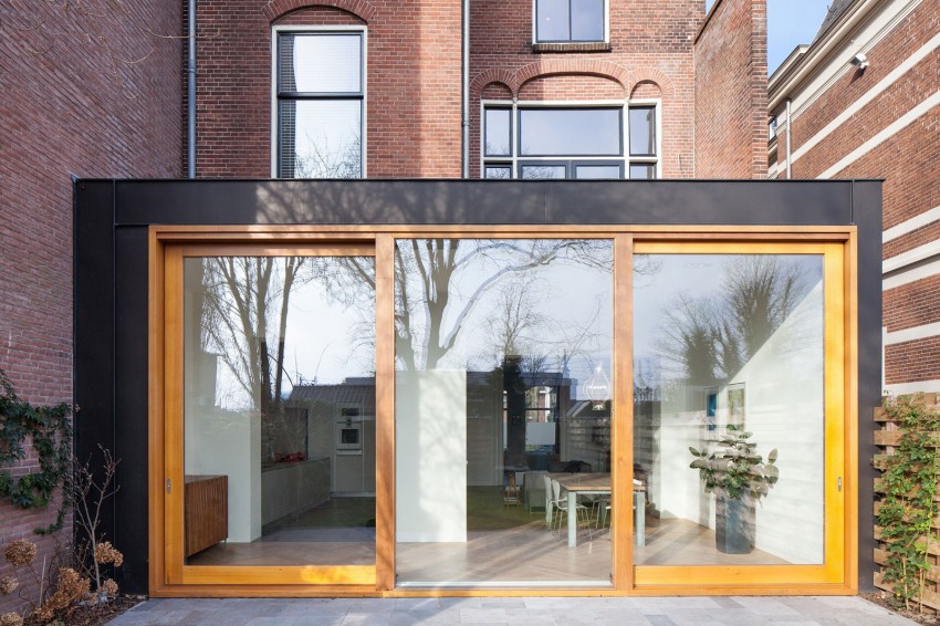
The house looks very nice and peaceful
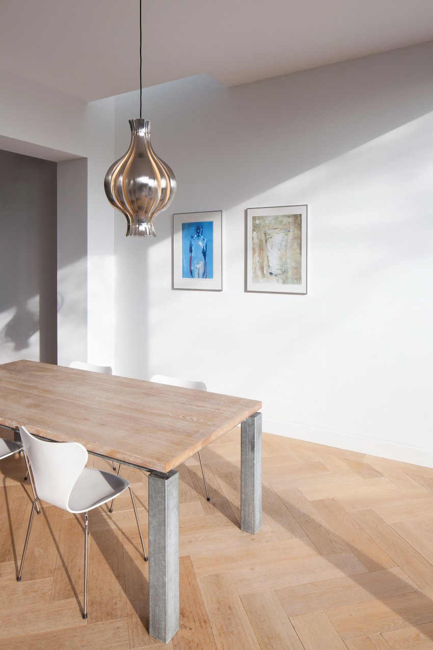
The atmosphere is filled with simplicity and homeliness.
From the rear facade, the architects erected an extension across the entire width of the house. The sliding doors connecting it to the old part of the building were made to order. Their height reaches an unprecedented size – 3.7 m.
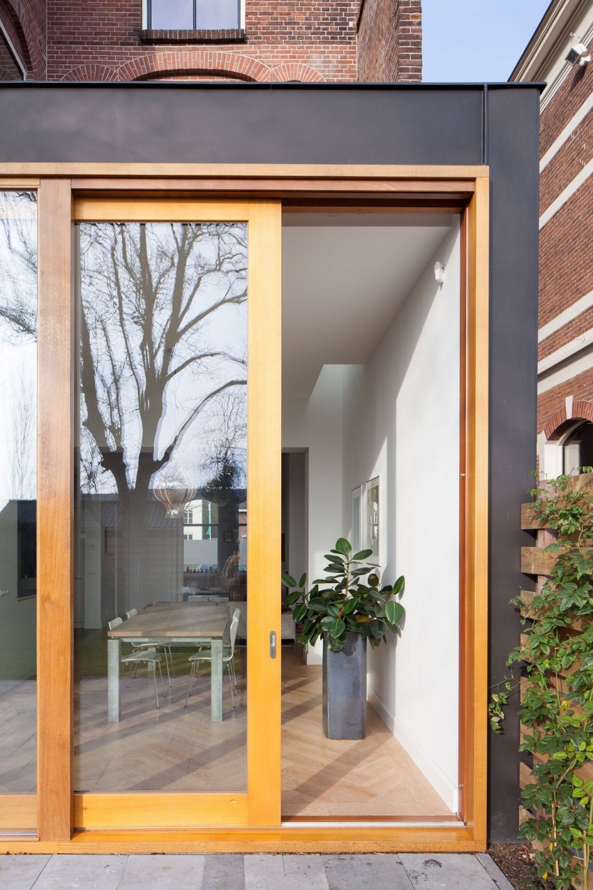
Magnificent doors. Great design solution
At the junction of the new and old parts of the house on the ceiling, you can see stucco molding outlining the outline of the original structure. Thus, at eye level, the entire space looks cohesive, but this charming detail, which can be seen only by looking up, creates a special cosiness. It gives uniqueness to the interior and visually separates the premises.
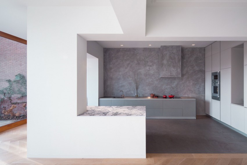
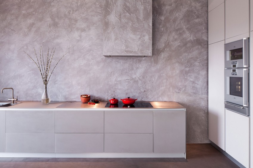
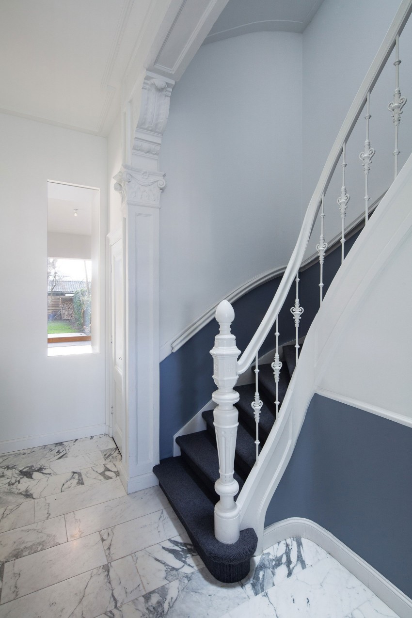
The design ended up being calm and classic. You can never tell that there were once offices here. Do you like the new interior? Share in the comments.